As user experience professionals, we are required to design and characterize digital interfaces that will allow users to perform their task to the best of their abilities and even enjoy the journey. To do this, first we need to design and build a usable interface.
In order for an interface to be usable, among other things, it has to fit to the environmental conditions of its use. Although this sentence sounds self-evident, often when thinking about the environmental conditions of users, they take into account generic cases such as sitting comfortably in an office, or using a mobile on a busy street, while in fact the use of digital interfaces can occur in a wide variety of environments and contexts. There are interfaces that are used in more extreme situations such as diving, mountain climbing, bumpy driving and even on the battlefield. In these cases it is extremely important to consider the environmental conditions when designing the interface.
In fact there are many environmental conditions that may affect product use and pose a challenge or difficulty. Because many digital interfaces are visual, one of the most influencing factors is the lighting conditions.
lighting as environmental conditions
When we specify lighting as environmental conditions, it can be internal lighting (from the screen) which is controlled by increasing/decreasing the brightness of the screen. Comparing to that external lighting sometimes is not controlled and can affect our experience while using it. For example, in dark places, we may be blinded by the interface, which will make it difficult for us to perform the task. Different example is in environments where there is a lot of lighting like sunlight without shelter, when using agricultural product, or strong artificial lights such as in concerts or operating rooms. In these cases the certain elements may not be prominent enough or be seen at all, thereby causing them to be missed and users to fail in the task.
In order to overcome the difficulties that the lighting conditions may cause when using the product, they must be addressed in some of the characterization and design stages:
Preliminary research phase
The product usage environments must be known and examined. It is preferable to check the lighting ourselves, but if this is not possible we can ask the product manager/Subject matter expert for these details. It is important to understand what the lighting sources are and how dominant they are in the environments of use.
Design phase
The application phase of the solution for different lighting conditions. At this stage it is important to pay attention to several key factors:
- Color – it is important to use colors that will be accessible to the user depending on the lighting. For example, when designing for interfaces in dark environments, it is better to use “Dark Mode”. This is to prevent glare from the screen. This mode is also used in complex systems with multiple information details because it helps the user to focus on information details easily.
- Contrast – The contrast of the interface colors affect the ability to distinguish between different elements and understand statuses in the system. In interfaces where there is strong lighting (natural or artificial), it is important to create a strong contrast that will stand out. On the other hand, in dark environments, too strong contrast can dazzle the user and create discomfort and pain during long use, so it is important to moderate it and create a gentle and pleasing contrast to the eye.
- Size – The rules of contrast and color also apply to the fonts themselves, but beyond that it is important to consider the lighting conditions when determining the size of the fonts. For example, while in bright environments there is a preference for large and prominent texts, in dark environments, there is a preference for smaller texts that also radiate less light out. In fact, the text will stand out more because of the contrast, so there is no need for it to be large and prominent, but in a way that is sufficient for the user to read in a usability test.
- Hue and Saturation – Hue determines the color’s proximity to the primary colors, and saturation – determines whether the color will be gray and quiet or prominent and glowing, that is, the intensity of a certain color. This is actually a weighting of the saturation and shade values that will determine the color. These dimensions determine how we will see the colors we have chosen, whether they will look brighter and brighter, or moderate.
In night lighting, you have to make sure that the light shades are not too bright, to avoid glare and vice versa in daylight – the sun could blind the screen and as soon as it is not bright enough, it will be difficult to see the content.
Usability testing
At this stage, we can test the design we chose in the previous stages and understand if it meets the user’s environmental and lighting conditions. In most cases, when it comes to office lighting conditions, it is possible to perform moderated tests by computer and remotely, for example by Zoom. But in cases where there are different and more complex environmental conditions, it is useful to carry out tests face-to-face in the field, when the subject tries the product next to the researcher. However we will not always have access to the area where the system operates due to distance or confidentiality. Therefore in these cases the environmental conditions are artificially simulated (as much as possible) so that they are as similar as possible to the real conditions.
Case study
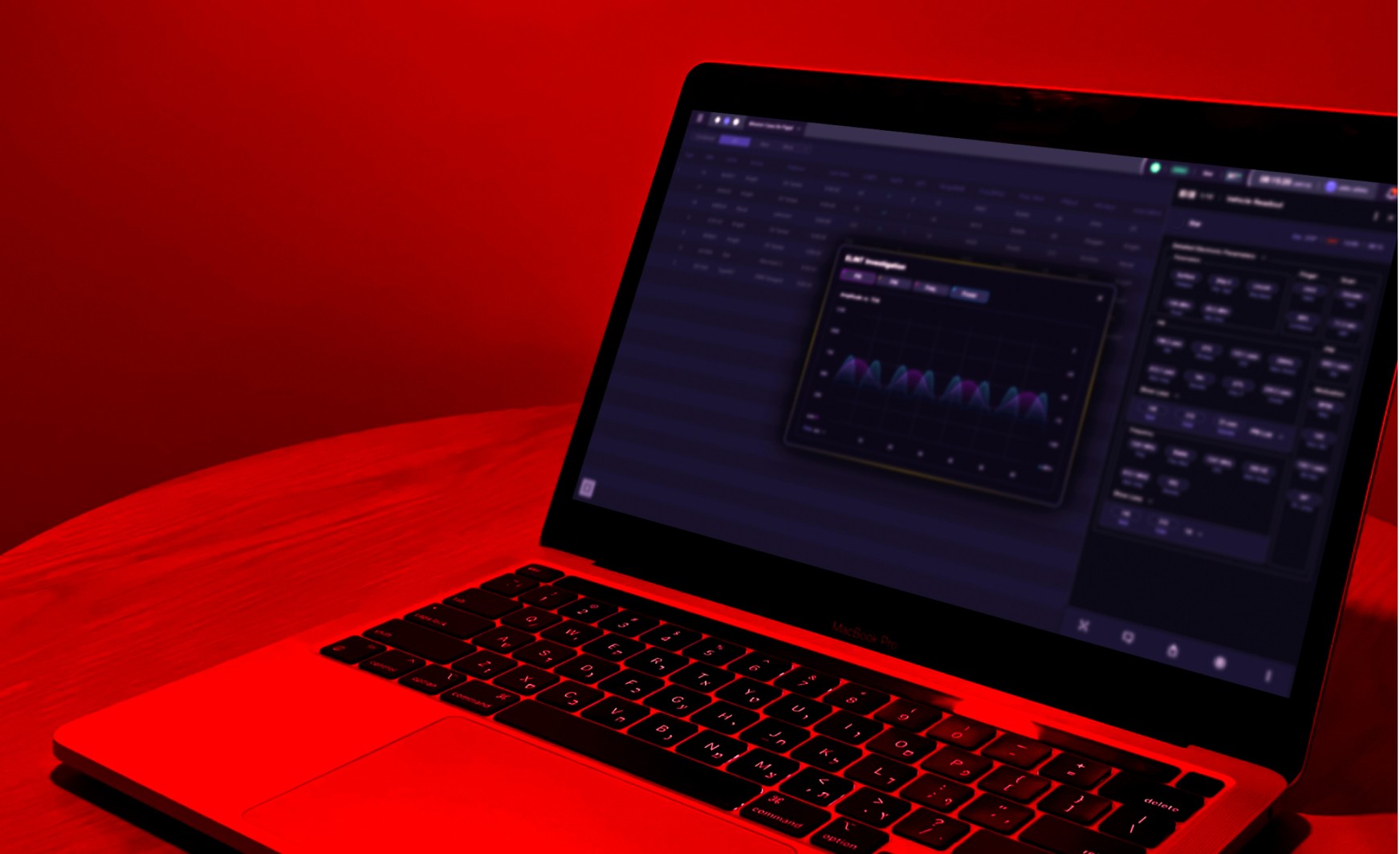
As part of a project we had to characterize and design a ship’s command and control system. The system is usually used in the Combat center located in the heart of the ship. This room is dark and opaque and the lighting in it is intermittently red. After characterizing and designing the system, we conducted usability tests, in which we examined whether there is an effect on the display of the screens and damage to the usability of the system due to the usage environment conditions.
Due to the inability to test the product in the natural environment, we created an environment similar to the ship, artificially (as much as possible) with the help of red lighting with a specific shade and strength as it is in the natural environment and in an airtight and dark room.
During the tests we noticed that there was a problem with the green color that we used in the interface, because it changed in the lighting condition and it was difficult to notice. The dark green shade we used “changed color”, because under red light green elements appears as black/grey.
In shorten, the reason for this is that green shade is pure red and vice versa. When the colors are mixed there is damage to the perceived shade. The same shade is also affected by the brightness and saturation of the colors that it consists of.
In complex systems, using the green color as an active status is a convention, therefore its use was necessary and cannot be changed. To solve the problem, we changed the shade of green to a lighter shade with a high saturation. Following this, the light shade of green had a high contrast to the other elements and colors in the system and thus increased the ability to distinguish it.
Conclusion
when we build products for human use, the conditions of the users’ environment must be considered. Environmental conditions such as lighting can greatly affect the performance of product users. Therefore, they must be considered in the preliminary research stages in the design – by color, size, hue, and saturation and in the usability tests – to evaluate our characterization and design with users. In a case study in our project, there was no access to the users’ natural environment, so in the usability testing phase, we artificially created the relevant environment and tested several users in several scenarios. The tests revealed a lack of distinction in the shade of green we used as an active status in the system, so we changed it to a lighter shade, with a higher saturation so that it could be distinguished.